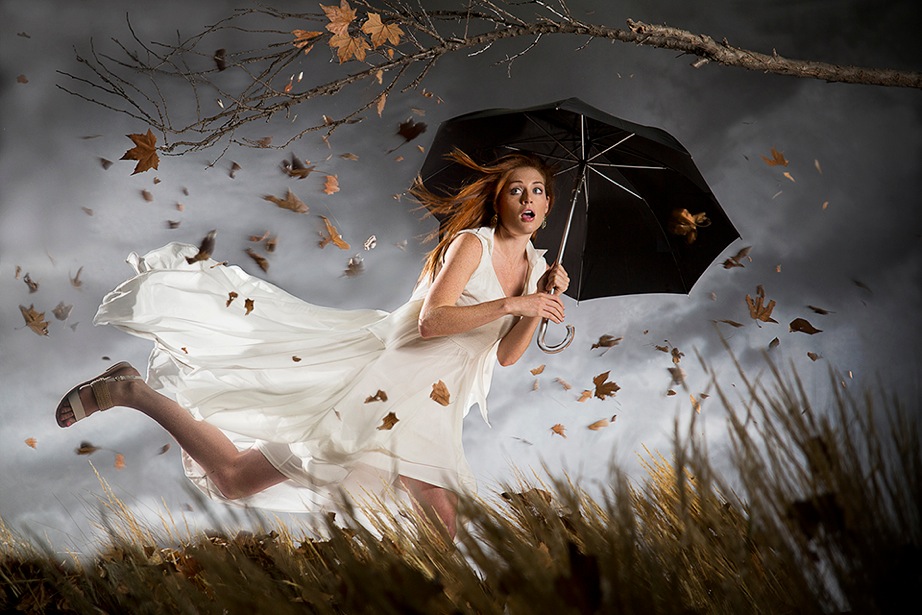
Today on The Slanted Lens, we are creating a fantasy portrait with simple elements. We’re shooting a stylized shot of a girl holding an umbrella in the wind — just a fun exercise in lighting on a set.
We will create an environment with three main elements: 1) clumps of grass in the foreground, 2) a tree branch from my backyard, and 3) a gray and gloomy backdrop. We created a small structure for her to lean on that will give the impression that she is leaning into the wind. A couple large fans and some handfuls of leaves will complete the set.
It does not take a lot of large elements to create a large looking set. Get out there, take those elements around you and create some interesting environments.
Thanks for watching! Keep those cameras rollin’ and keep on clickin’.
Don’t forget to enter our July 2014 INTERNATIONAL giveaway to get a chance to win a NeroTrigger or Light Blaster!
The Final Image
The Lighting Breakdown
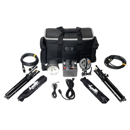
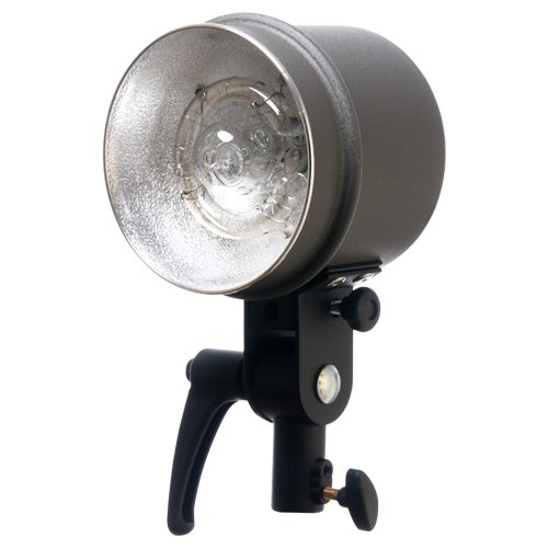
Jay P Recommends for this Shoot
Video Transcription
July’s giveaway, Light Blaster, Nero Trigger. Look at the end of the video.
Today on The Slanted Lens we’re shooting a style life shot of a girl with an umbrella being blown by the wind. Just a fun exercise in lighting and also a look at just simple set pieces. We’ll create our environment with three elements. Number one, clumps of grass in the foreground. We’re going to bring these closer to the camera and further from the camera, just kind of space them out. Closer we bring them to the camera, the larger they’re on the foreground and more of the frame they cover. They also give us more depth as they fall out of focus on the foreground. Number two is a tree branch overhead. We have tree branches held up by a clamp in the foreground on a cam bolt stand. This is going to frame the top of our frame to give us just a little bit of framing overhead. Number three is a backdrop. It’s grey and mild kind of looks like stormy sky. Just non script makes a nice background for us. I also created a small structure to lean against to give the impression she’s leaning into the wind. Last of all, we’re going to add wind and leaves to create action in the frame.
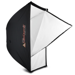
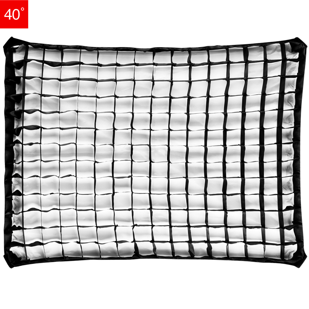
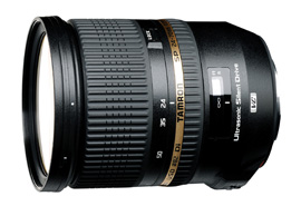
Let’s get started. I’ll be shooting on the 24-7mm Tamron lens at about 63mm. I set the Aperture wide open at 2.8 so my aperture fill is very shallow. I’ll set my shutter 160 to the second to slow down the leaves but not stop them. Then the ISO set at 250 to make the other settings possible. Let’s look at the lighting breakdown. Our first light is a Dynalite Studio Head with a medium soft-box with a grid. These Dynalite Studio Heads have very nice soft quality about them, makes a very nice light. We’re now at a three background lights. These are three PhotoFlex Flex Heads. They’re going to be on the floor aiming up towards the background. I want it to be dark with the top and light at the bottom. This gives me a sense of depth or the sun kind of going down. Our last light is a Dynalite Travel Head with no modifiers or rim light. That’s going to give us a nice hard light in the left. It’ll rim her, it’ll rim the grass. It gives us just a lot of depth, makes for a nice look. Everything is ready now, we’re going to go ahead and start the shoot. In order to get the dress up so it catches the wind, we’ve fishing lines tied in about three places that will help pep the dress up, let it catch little wind underneath it, and the guys now start to throw leaves into the fan as we shoot its frame. This process is slow and gets a bit tedious as we have to throw leaves and lift the dress after each shot. To create the flow and look at her dress, Julene took two dresses from H&M and layered them one on top of the other. The top dress was cut all the way up and the bottom dress was slit just above her knee. This gives us lots of fabric to blow in the wind. Julene go in and photo shop, kind of clean up the rough edges. Here’s some of the unedited images using the structure.
Here are a few where she did not use the structure and just leaned forward. You know it really doesn’t look that bad, I think this is almost as effective as the structured and maybe one of the ones I’ll use. This really will become a composite image when we’re done. In pose Julene will take several images and composite them together. Leaves from one and a dress from another, a body from one and a face from another. I want the background a little more out of focus so she’ll outline the girl and make it a little more soft in the background. Let’s take a look at the final image. I love this type of image, I find this shooting create a great product. Now it really doesn’t take a lot of large elements to create a great looking large set. We’ve got some old grass and tree branches I cut down from my yard, that really becomes our set. So get out there, take those elements around you, create some interesting environments. Keep those cameras rolling, keep on clicking.
Here’s our international giveaway for the month of July. A Light Blaster and a Nero Trigger. Go to TheSlantedLens.com and sign up. Don’t miss out.



Leave a Reply