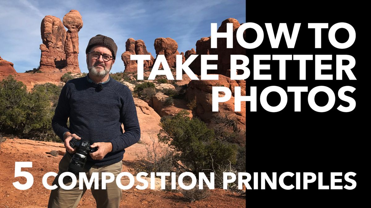
In this photography tutorial Jay P teaches you how to take better photos with your camera using 5 composition principles. These 5 basics of design will help you learn to see and identify ways to create better artistic images.
Stop cluttering your images with too much stuff. Composition principles next from The Slanted Lens.
So let’s talk about the five composition principles that every photographer should understand to apply and critique their own work.
- SIMPLICITY is exactly what it says. Simplify your frame. Boil your frame down to three or five strong identifiable elements. Like behind me right now the Red Rock really becomes an element, the blue sky becomes an element and my body becomes an element.
Those three together now make a much more simple frame than if I would have stood in front of a tree that has all kinds of stuff going on behind me. That becomes a busy element. It’s one of the reasons you want to shoot later in the day. Because as the light drops, and the shadows decrease, you don’t have as much texture or as much contrast and the elements start to come together. You can have an entire group of trees. But if that entire group of trees is slowly moving away from us, and the light softens, that becomes one element in the frame. Many times when I feel like my frame is way too busy I will drop down low and put my model up into the sky because that gives me a simple sky. That entire sky becomes one element, my model becomes the second element, the grass in the foreground along the bottom becomes a third element. When I shot the arches this morning, I wanted to boil that down to simple elements. The arch becomes a strong dark shape. The blue sky or skyline or sunrise becomes one element. And then we have the plants in the foreground. That becomes very simple.
- RULE OF THIRDS. If you divide the frame into thirds horizontally and then divide the frame into thirds vertically, where those lines cross each other become the most dynamic places in the frame.
You don’t want your subject matter to be in the middle, you want it to be up in one of those corners. So if you have a person, you’re going to push them up into one of those areas. That’s called a rule of thirds – up high, right or left looking into the middle. That’s the most dynamic place in the frame. If you put them in the middle, that entire frame dies all around them unless there’s lines pushing toward the person in the middle. So work the edges of the frame. That’s the rule of thirds law. You want to get people or subject matter in one of those rule of third areas to make your frame more interesting. It makes it simpler and allows you to control that frame much more easily. So the rule of thirds is a very strong principle. Just about every single image that’s successful will in some ways, use a rule of thirds or break it. And I’ll tell you next how the rule of thirds leads us right into the next composition principle. And that is balance.
- BALANCE. If you put an object up in the upper right hand side on the rule of thirds, then you want to balance it in the frame with something on the lower left side of the frame.
That becomes a balanced element. You don’t want them to be the same size because that balance is too stagnant. You want them to have different shapes and different sizes. That balance becomes more dynamic. Put something high in the frame on the camera left side. Then you will want to put something low in the frame on the camera right side. You want to create balance. These are elements that are bouncing back and forth visually as you look at them. It keeps you engaged in the viewing experience much longer if you have balance working off that rule of thirds. A large object with a small object, a red object with a blue object. Something that’s going to give you visual balance and causes us to look at a different part of the frame. So we don’t just concentrate on one area, but it leads us to a different area. And that creates a viewing experience. Next we’re going to talk about leading lines.
- LEADING LINES is a concept that allows you to center punch or put people in the middle.
Objects can be in the middle of a composition because you can put leading lines like a road that comes along and diverges behind the subject matter. That becomes a leading line. It leads into the subject matter. It’s really important if your leading line has something to do with your subject matter. If it’s just something that’s random, like a telephone pole, it doesn’t really work. But if it’s a stream that leads into a beautiful landscape, that’s a beautiful leading line. It leads us into the composition. Remember in composition we read from left to right. We start on the upper left hand side, and we move across the frame and we work our way through. We want something that brings us back. So a lot of times when you have a leading line that comes from the bottom of the composition and pushes up into the top it brings us back into the viewing experience one more time as we go through that image. Again, leading lines are very powerful. It leads us to the subject matter. When I say leading lines, they don’t always have to be straight. They can be curved. They can be straight. They can be meandering. They can be a lot of different ways. It can be s shapes. Linear lines help us create a dynamic composition. It’s also a way to break the rule of thirds law. Leading lines helps us to be able to create a dynamic composition without using the rule of thirds. - FRAMING. The fifth composition principle is framing. You’ve seen framing so many times – a window, a doorway or an arch.
I framed one of the arches with another arch, that’s framing. I saw a great shot of the Great Wall of China through a window and you see the wall disappear into the background, that’s framing. It’s giving us something in the composition that says, look at this. That’s really what framing does. It can be an overhanging tree. It can be an entire grove of trees around a person. There are so many different ways to create a framing experience. It frames your subject matter and directs the eye of the composition into your subject matter to what you want people to look at. Framing becomes a very powerful composition tool.
So there’s the five composition principles. Now the reality is, a lot of times great images will apply one, two or three of these composition principles. Maybe even all of them.
So here’s your assignment. Go out and shoot and apply one principle.
Is there a composition principle that you think works most for you? Just leave a comment on our YouTube channel and let’s talk about it. I’d like to see the image. Put it on a Facebook group. Just get out there and shoot and use those composition principles. And keep those cameras rollin’ and keep on clickin’.
See what I can fit in my 2217 SKB case. This bad boy can carry all my Westcott strobe equipment.