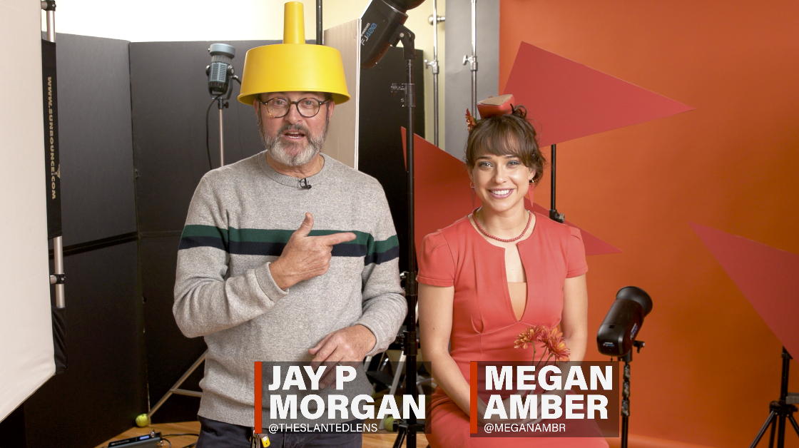
Jay P demonstrates 3 easy lighting setups for doing Monochromatic Color Portraits and he demonstrates how to get color matching with your wardrobe, backdrops, set pieces and props. We use the super helpful ColorReader EZ for easy color matching. Take a look and let us know what you think.
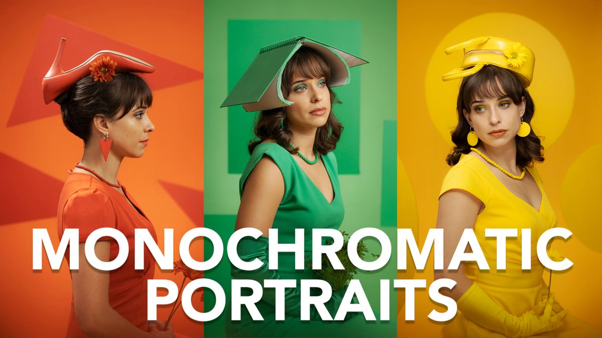
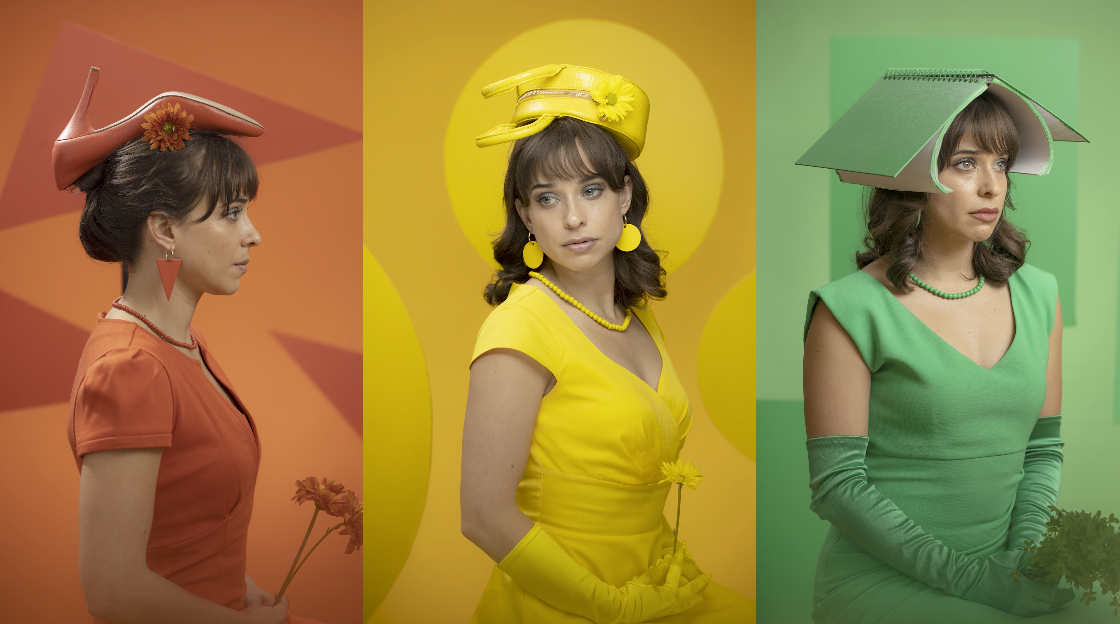
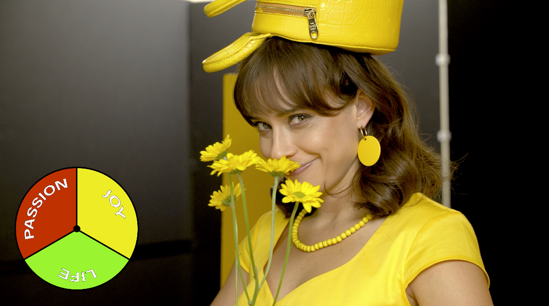
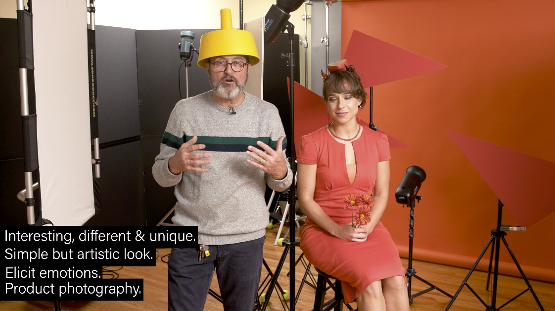
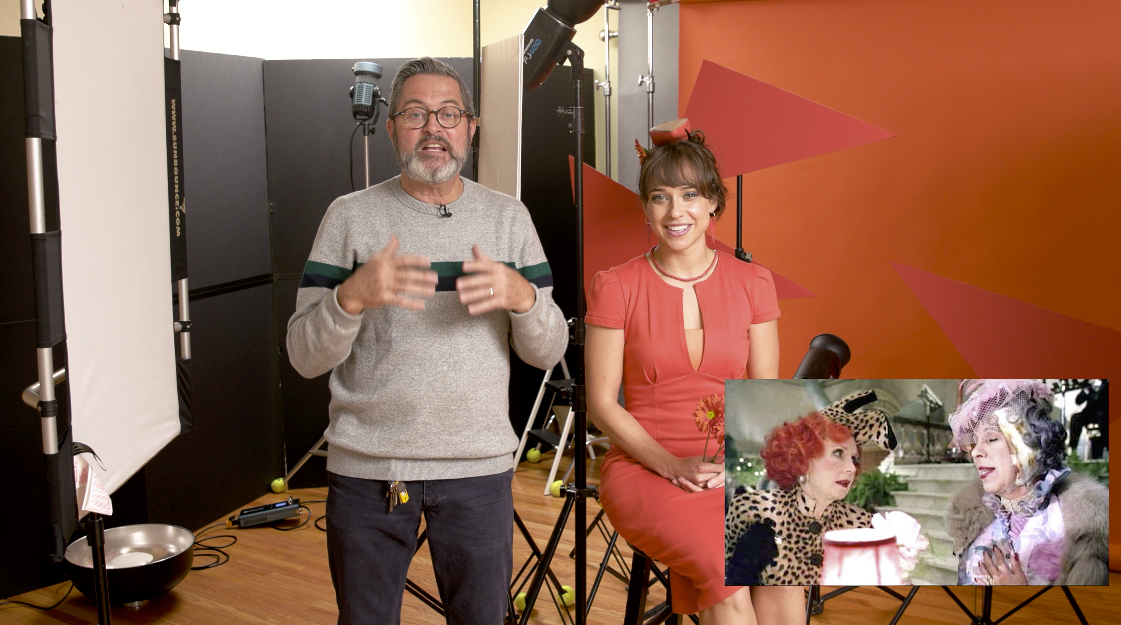
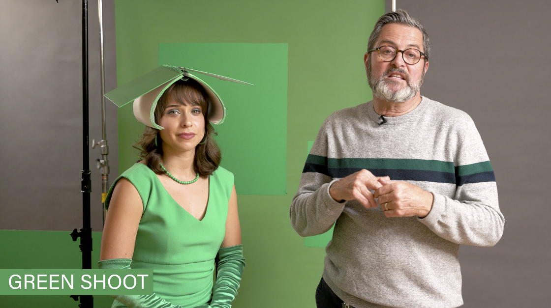
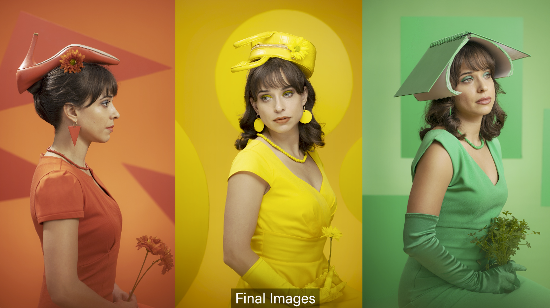
Today on The Slanted Lens, I’ve got Megan Amber here with me. Megan is going to help me show you three monochromatic portraits. Why would you shoot a monochromatic portrait? First off, it’s interesting, it’s different, it’s unique, it’s something you can do that gives you a fresh look at a portrait. When you paint everything the same color in a portrait, it also takes all those elements and turns them into one element. It really makes your composition much more simple. You have a very simple background. Everything becomes the same color. So it’s a great way to give you a simple background, a simple look at the world. But also that thought of looking at the world in all the same color is an artistic statement. You can take all the elements that represent a person and a place and paint them the same color. And now it becomes your artistic look at that situation. Also, they communicate a lot of emotion, a red portrait, a yellow portrait, a green portrait, they’re all going to have different emotional responses. Because color creates emotion. It’s also a great way to do products. If you have a product that has a strong color, put it in a scene that’s all monochromatic in that same color. It supports your product. Or if you have a product that is black and white, put it in a monochromatic color scene. And that black and white product really pops out and looks incredible. So there’s a lot of great reasons why to shoot a monochromatic color portrait or image. It is so powerful.
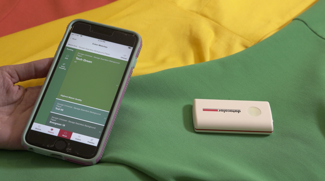
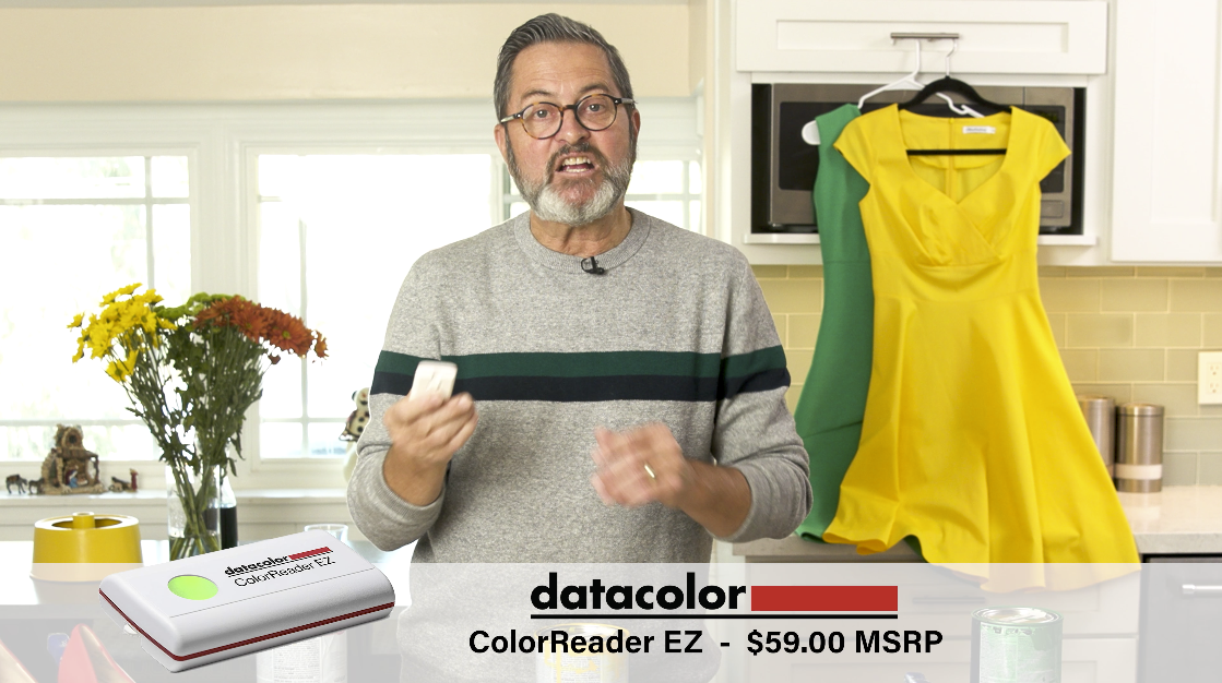
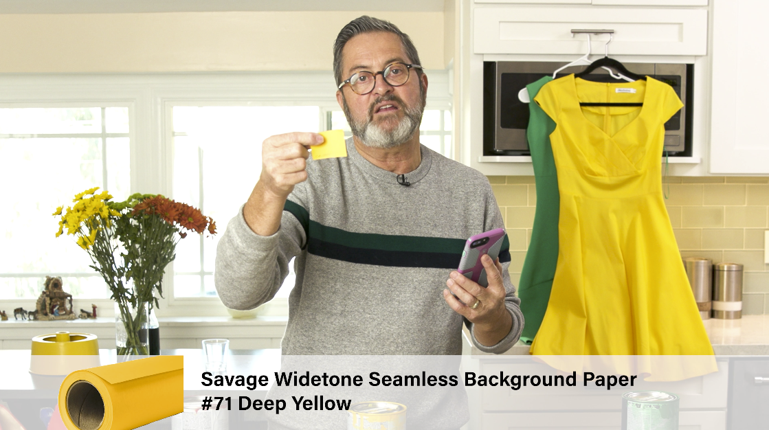
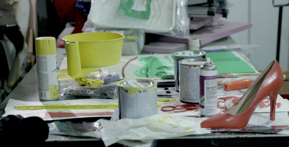
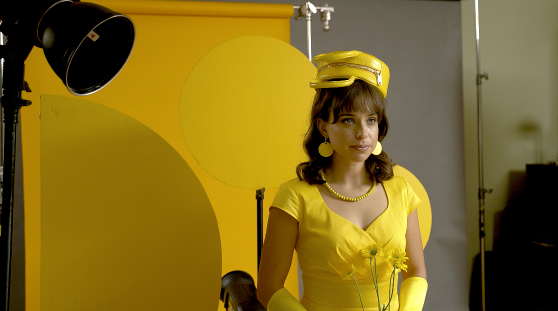
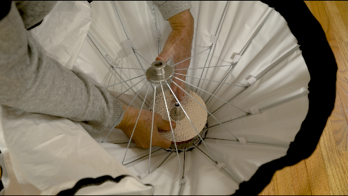
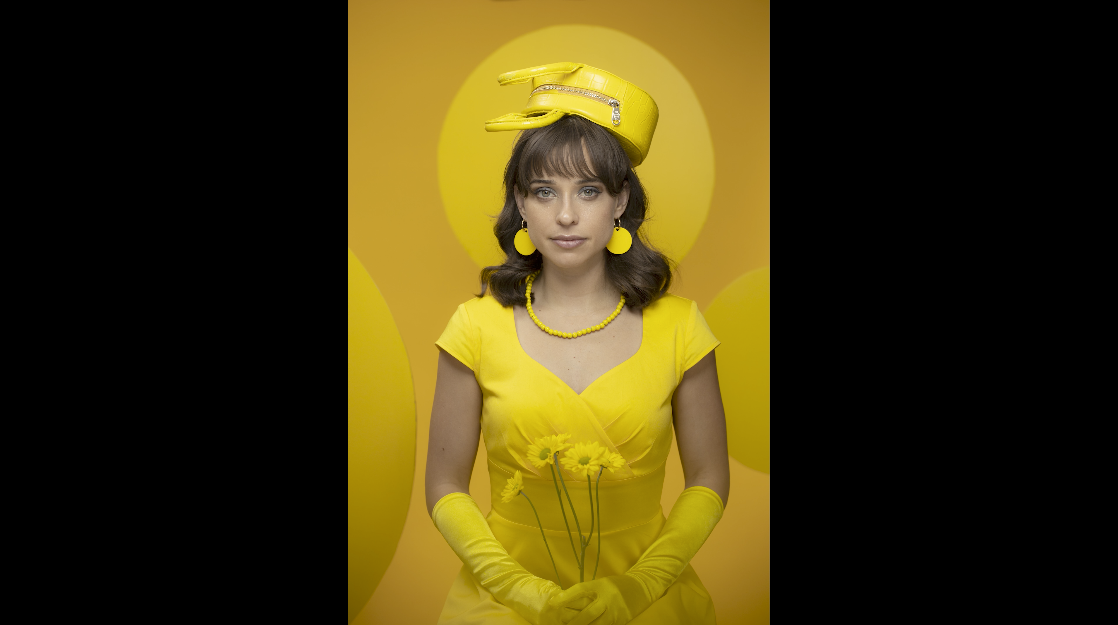
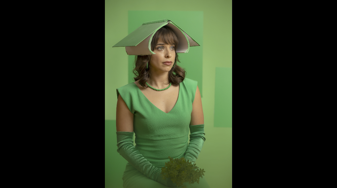
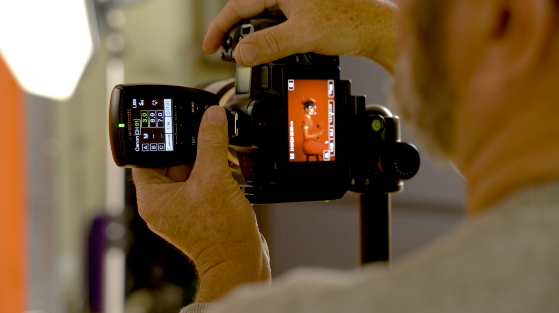
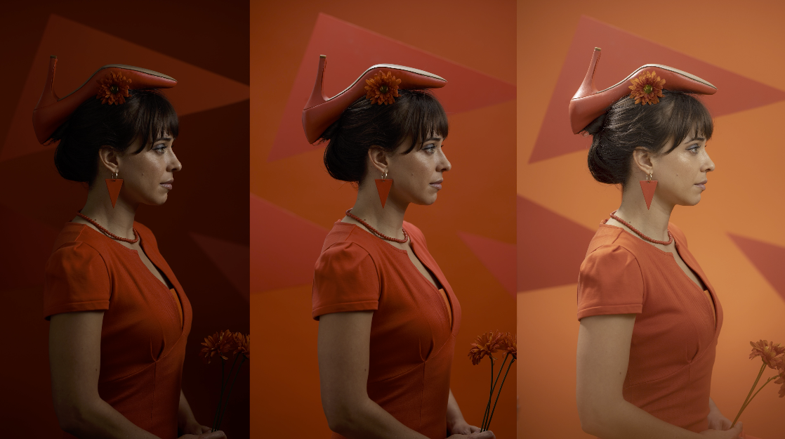
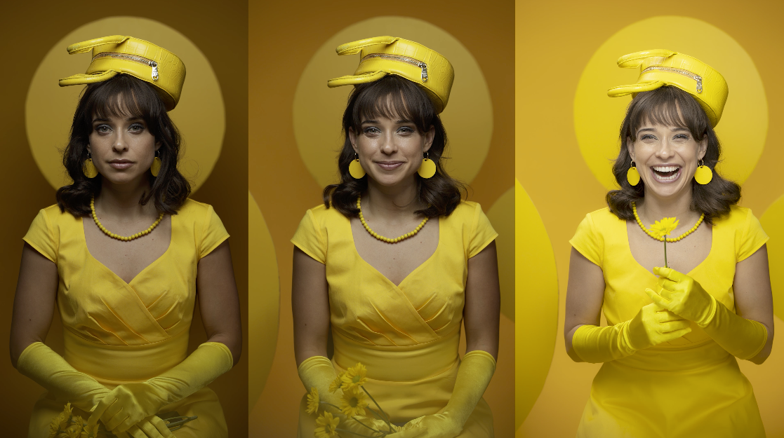
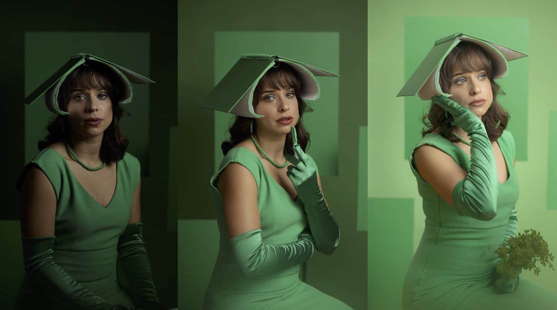
Let’s take a look at how we created all the props and got them the same color. We’re using that datacolor ColorReader EZ, which really makes this process so simple to match to the seamless and to match to the different paints. So let’s talk about how we matched our background, our wardrobe and our props that we used for these portraits. This is always the hardest part of this process. You’re trying to get colors of different items and they’re always different colors or different shades. It’s all yellow but you know what, that’s close, but not that close. So we’re using the datacolor ColorReader EZ. This is a color reader that reads colors of different things. We start out by just simply clicking on the dress. We have a yellow dress and a red dress and a green dress. When we click on it with the reader it comes up in the app, because this works with an app. This app is fabulous. Because now in that app, we can look at several different things. The first thing we did is we looked for the closest savage seamless color to that yellow dress. And if I click on the dress it gives me a Savage reading. It says Savage number 71. So there’s a Savage paper that we found, number 71. That’s going to be the closest color to that dress that Savage makes. That gives us our background. Next we looked at the paint colors, we can go in and say we’re going to go to Lowe’s. What’s the Lowe’s color that matches this dress. The app gave us a very, very close match, extremely close match. Then we painted most of the things that used on set. We painted the handbag that looks like a pillbox hat on her head, the pearls, the earrings, and just made it very, very simple. The styling for this is a nod back to “Brazil”. I love the movie “Brazil”. It came out in the 1980s. It has interesting styling and interesting wardrobe. The main character wore a hat, that’s a shoe. So we’re going to do those kinds of hats but in monochromatic color settings here, but we’re going to give ourselves shapes that kind of look like the hats that they wear, this shoe hat is going to be a triangle. So we have those triangular shapes and we can create some depth with those in the shot. And it gives us a little more depth in that monochromatic setup. She can have hand props and things that are all painted and styled in that same color. We have a round purse for the pillbox hat with some round shapes. And then we go to a book which is more square shapes. So we’re using shapes and monochromatic colors and putting those all together to create the styling for our monochromatic color portraits.
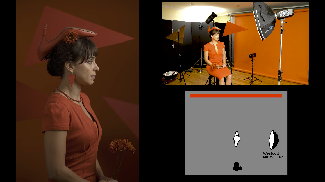
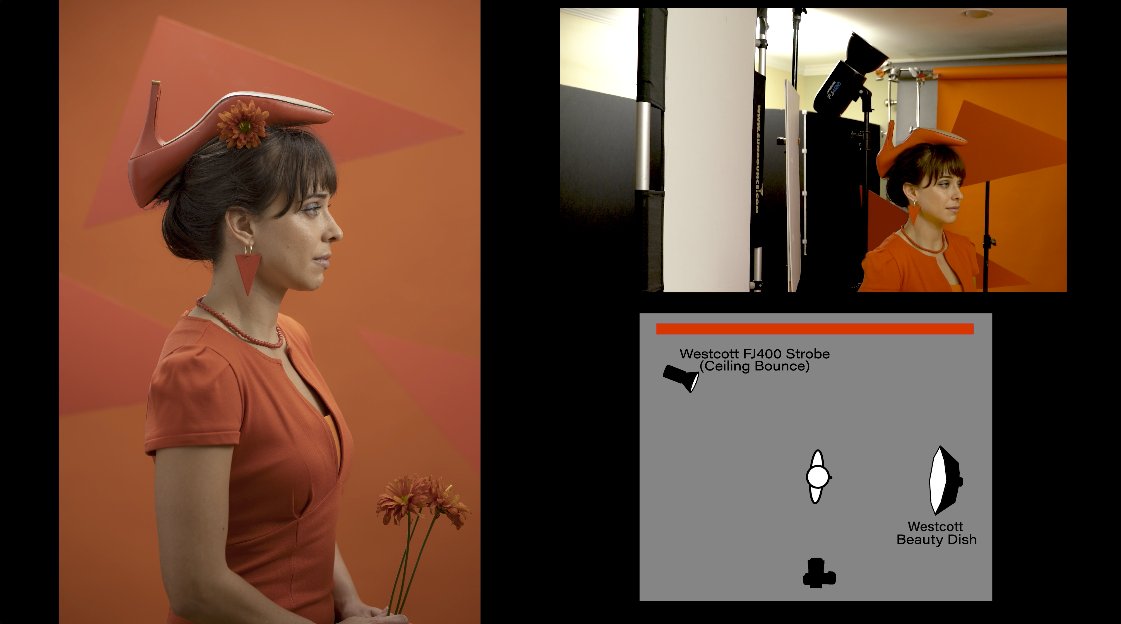
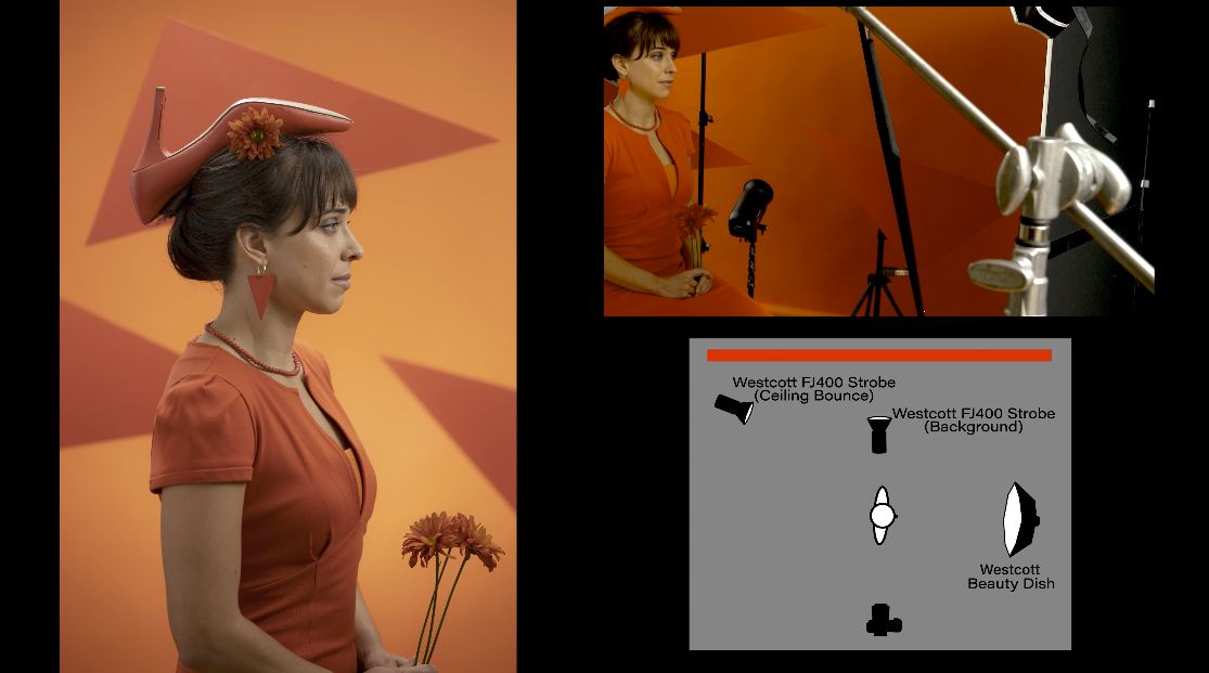
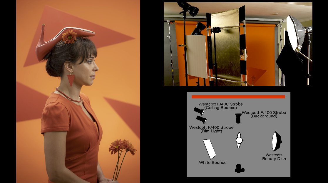
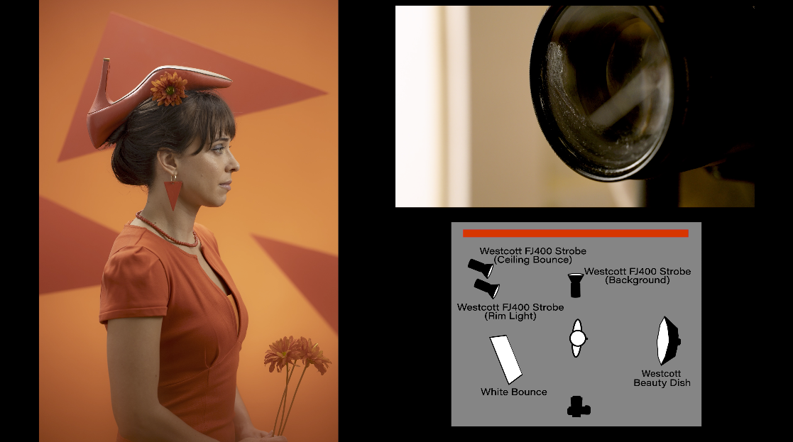
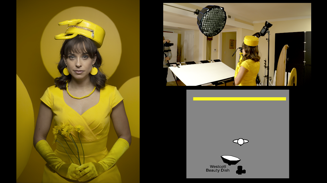
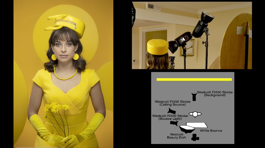
There’s our first light. We did this two different ways. We used a beauty dish, the Westcott 24 inch Switch Beauty Dish. We shine that straight into her and that gives us a nice light on her face. We then went to a bounce light into the ceiling and that bounce light in the ceiling opens up the background and gives us a nice background. And then we put a light on the background to give a separation between the triangles and the foreground. Then we put a rim light behind that gives us a rim on her shoulder. And then last of all, I put Vaseline around the bottom of a filter on the camera and that kind of blurs the bottom of the frame. It just makes that foreground blur. It makes it so it is not so distracting. It gives us more of a focus on her face and not so much on everything else.
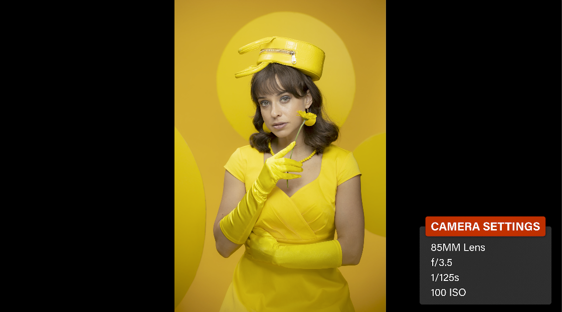
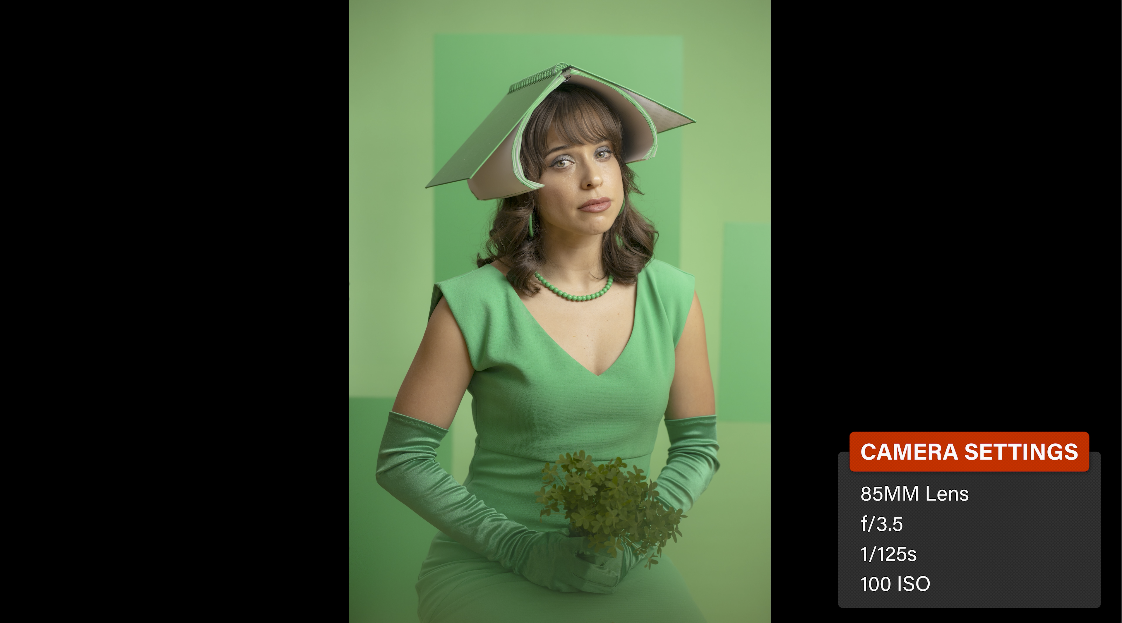
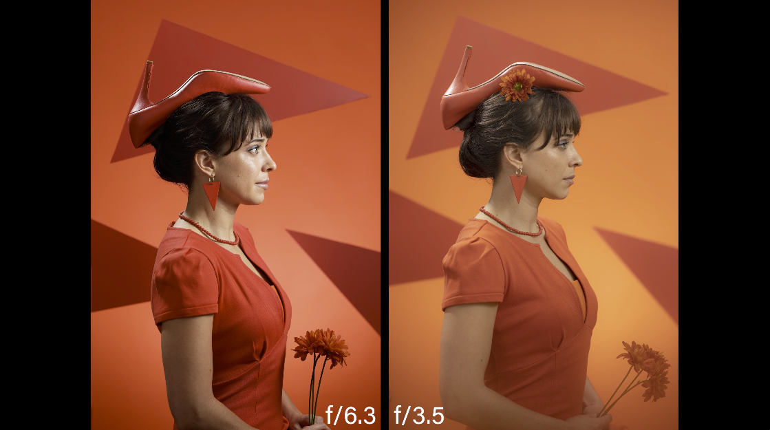
A quick note here on camera settings. I’ve chosen f/3.5 as my aperture setting. The reason I’m doing that is because these shapes are right behind her head. I want them to fall out of focus a little bit. I want the edges of them to not be so hard. I want them to be a little more soft. So at f/3.5 It looks good. When I was at f/6.3 or f/8 they were way too defined. This gives us a little bit of depth of field fall off back there that makes the shapes look very soft. I’m at 100 ISO which I always shoot with strobes at 100 ISO. Because I have plenty of light with the strobes. Shooting for like 200 or 400, there’s no reason to do that when you have strobes. And so this gives me a nice shallow depth of field. And a great image at 100 ISO.
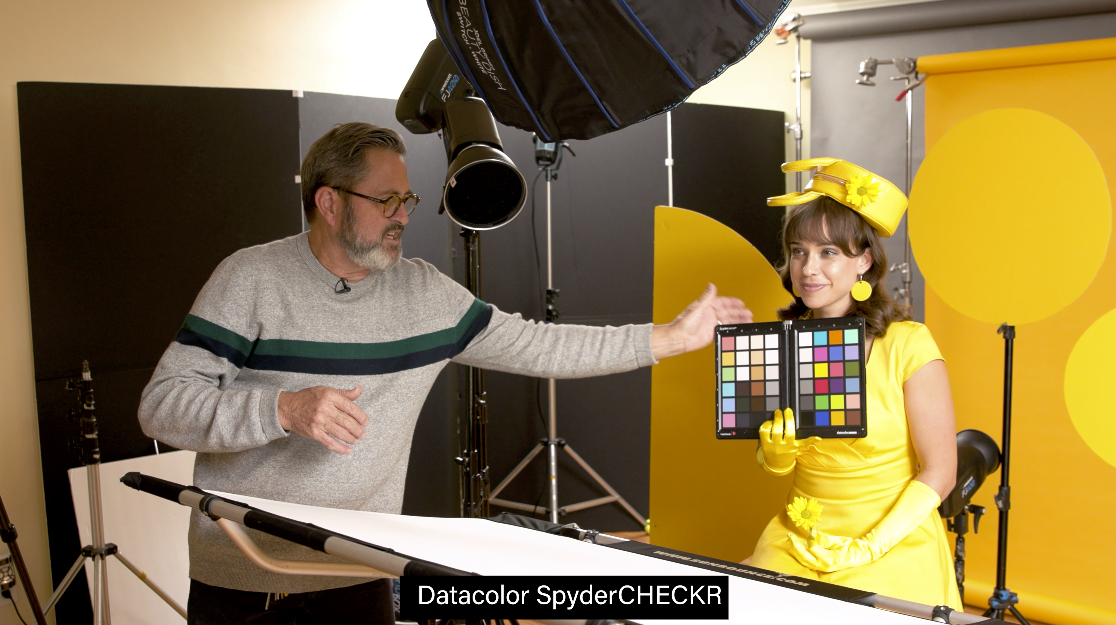
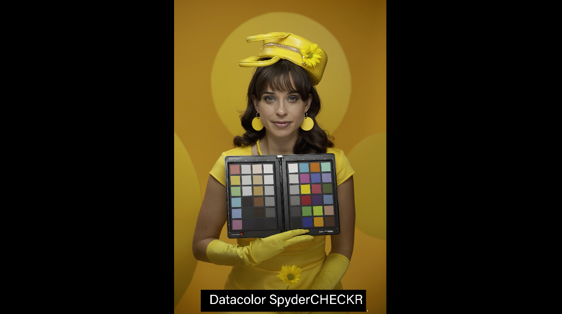
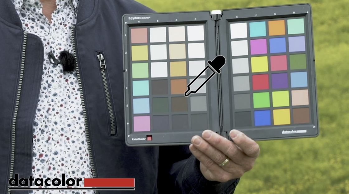
Next I do a quick shot with my SpyderCheckr. I place it just underneath her chin. Then we’ll see the light there on the gray square so I can sample from that for my editing.
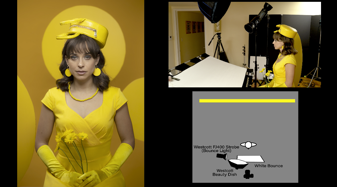
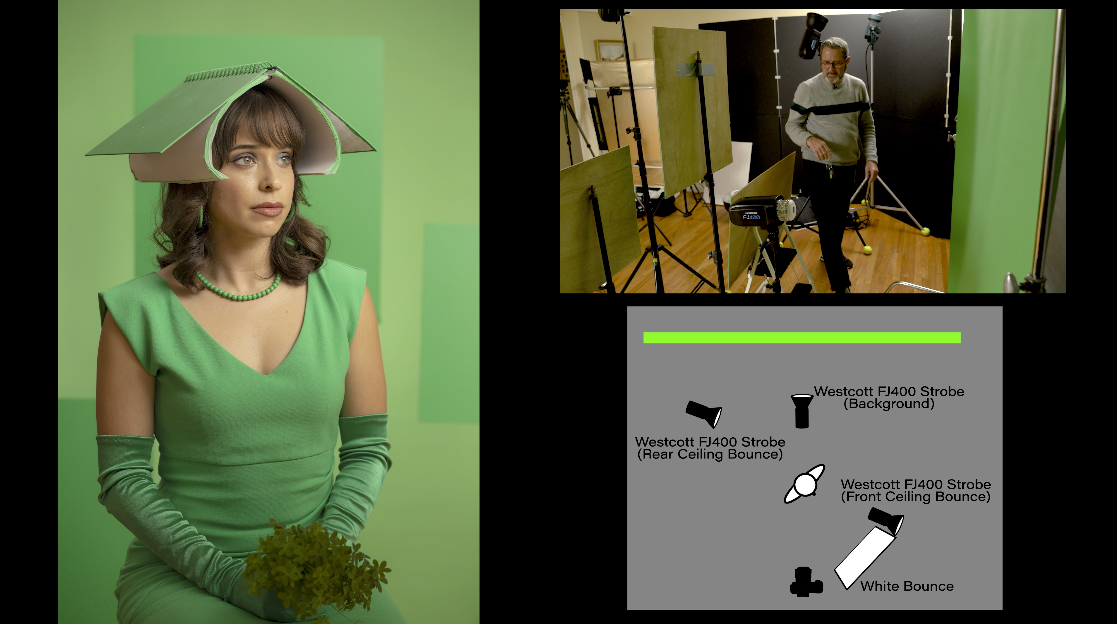
Let’s break down the lighting that we have. First off, let me explain a couple of things. Here, we’ve got a small 24” beauty dish. Inside the beauty dish is a little silver insert. The insert is bouncing the light back into the softbox. And then out the front, we have a grid on it. That becomes a key light.
It’s in a paramount or a butterfly lighting position. It’s going to drop a nice little shadow underneath the nose and underneath her chin. Then we need to open that up and fill it because we have a grid on the beauty dish. The grid takes the light off from the front of her dress. It’s going to vignette the front of the dress. We really don’t get any fill off from this reflector. There’s no fill coming off from this reflector because there’s no light hitting it from the beauty dish. So in order to accomplish that we’ve placed a light over on the camera right hand side. It has a grid on it. That light is putting light into this reflector to be able to fill underneath her chin and open up the shadows. So that’s our main key light setup. Then in the background we have one light on the background directly on the seamless behind to be able to give us some separation. That opens up that seamless. And then we have a light that’s been bounced into the ceiling. That’s going to open up our shadows and open up around shapes a little bit. And that gives those shapes some dimension so they’re not just a black shape. The last thing we do to add a little bit of Vaseline along the bottom of a filter just to blur out those hands a little bit and take away the hard edges. That makes it look very nice.
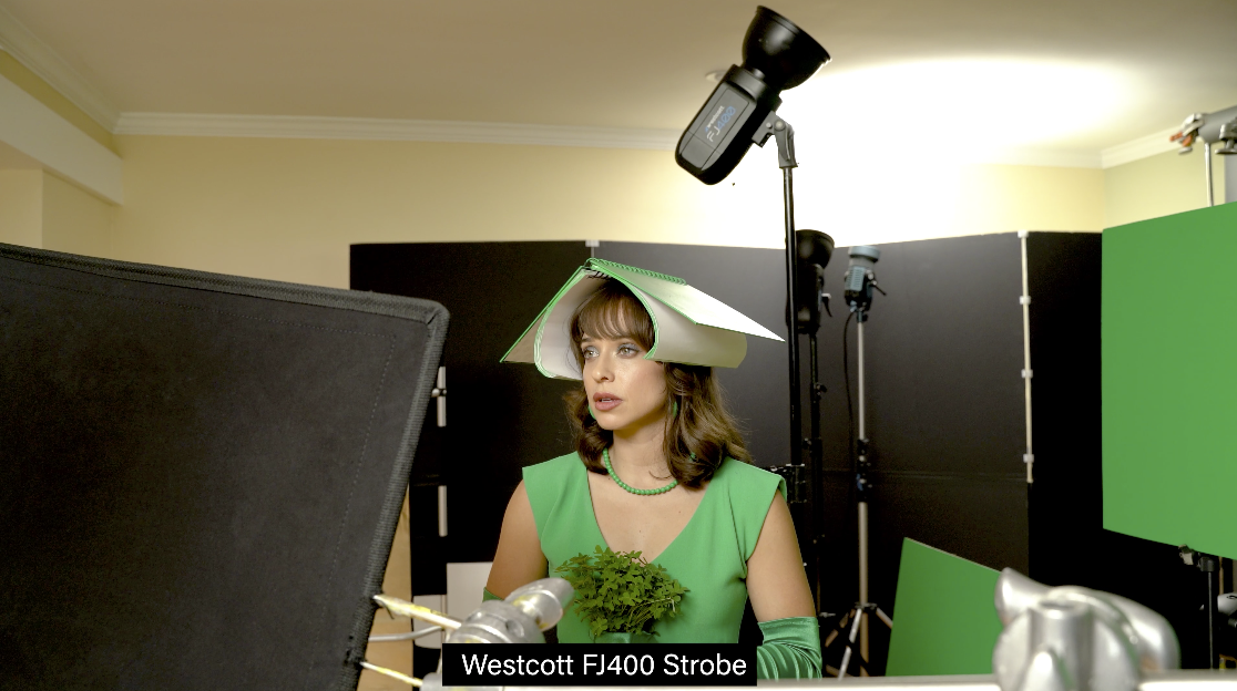
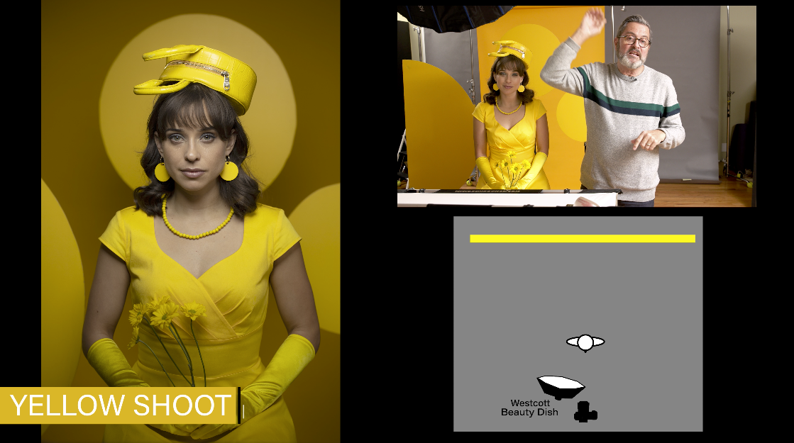
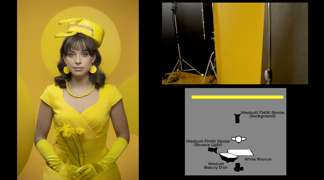
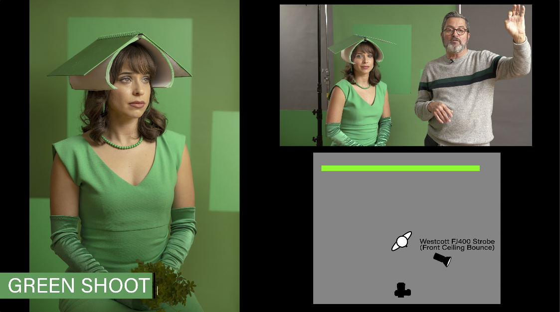
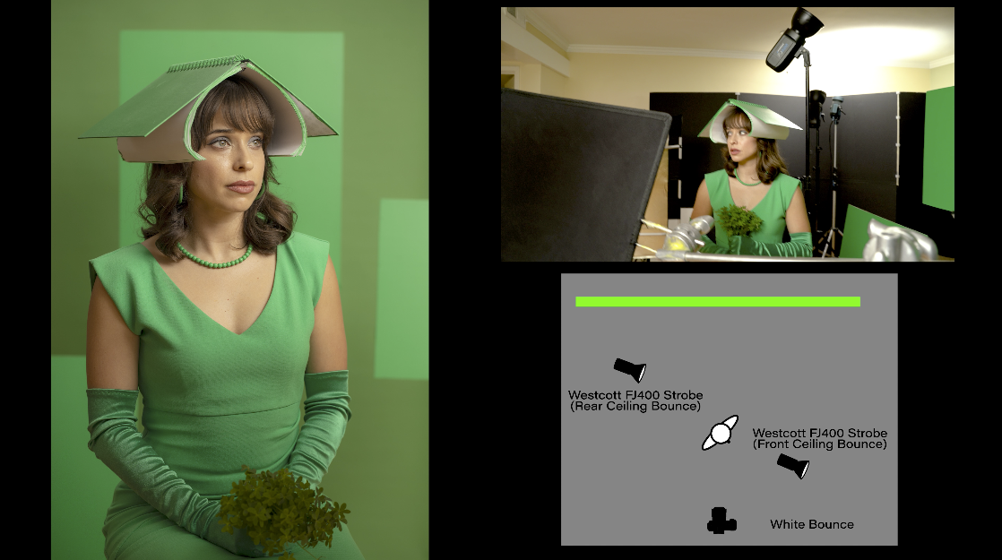
Let’s break down how we lit this little setup here. We had set a 300 D, which is a video light in the corner over here. And it was giving us a great light on her face. And so we decided to put a strobe light in the exact same place. So rather than a softbox, or a beauty dish that’s very directional, we shined the strobe up into the ceiling. We put a Westcott FJ400 shining into the ceiling and turned off the 300 D. And that gave us this beautiful bounce light on her face. It wrapped around because it’s bouncing into the ceiling. So it gives us a big area, a large source, which gives us a nice light on her face. It gives us a nice fill light as it wraps around her. And secondly, we have a light bouncing in the ceiling right behind her. And that ceiling light is going to open up these three squares behind her and give us a little bit of light on the top of the book. The last light is one behind that’s on the background. And that makes that background brighter. It can be adjusted to make them almost the same tonality or make it darker as well. That’s basically our setup, very simple setup. Last thing we did was we added a little bit of petroleum jelly or Vaseline on the bottom of the lens filter that gave us that kind of fog underneath.
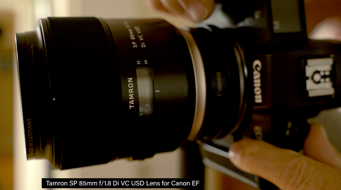
I’ve shot all these portraits with a Tamron 85mm lens. I think it’s a fabulous portrait lens. It’s the Tamron 85mm 1.8. If you have anything wider than that then these backgrounds are not going to work, because these are only 48 inches wide. You can get them wider though. I need to use a longer lens which collapses the background and makes it easier to stay on the background. But you’ve got to get further away from the subject matter.
So there you have it, three lighting breakdowns for monochromatic portraits. The reason we wanted to go through these is because I want you to see that sometimes it’s a very experimental process. You put up a light and you look at it. If it doesn’t work you try to get another light and see if that works. You’ll start to work with them and augment them and try to make them work together. The last one was a really good example of that, because we really thought we wanted a directional softbox on her face that was going to look fabulous. But in the end, we bounced it in the ceiling and got a much broader source and it just looked wonderful. So don’t get too tied into where you’re at. I do it, we all do it, but just be able to be willing to explore and make something happen. Each one of these portraits was lit a little bit different yet very similar in the way we approached them.
I hope you enjoyed this look at those monochromatic portraits and how we broke down the light. And how we lit each one of these. It gives you an idea of how to go out and light something yourself. I hope you can take this information and apply it to what you’re doing and make some great portraits. So keep those cameras rollin’ keep on clickin’.
Check out the Datacolor SypderCheckr. Click on the 80% gray and your editing and color balance is just that easy.