


Hi, this is Jay P Morgan. Today on The Slanted Lens we bring you an episode of the Laws of Light. We’re going to look at how to light shiny metal in a still life. 

This is difficult because we have shiny metal that needs its own attention. But we also have a still life that needs shape and dimension and needs to look wonderful in and of itself. So let’s get started.

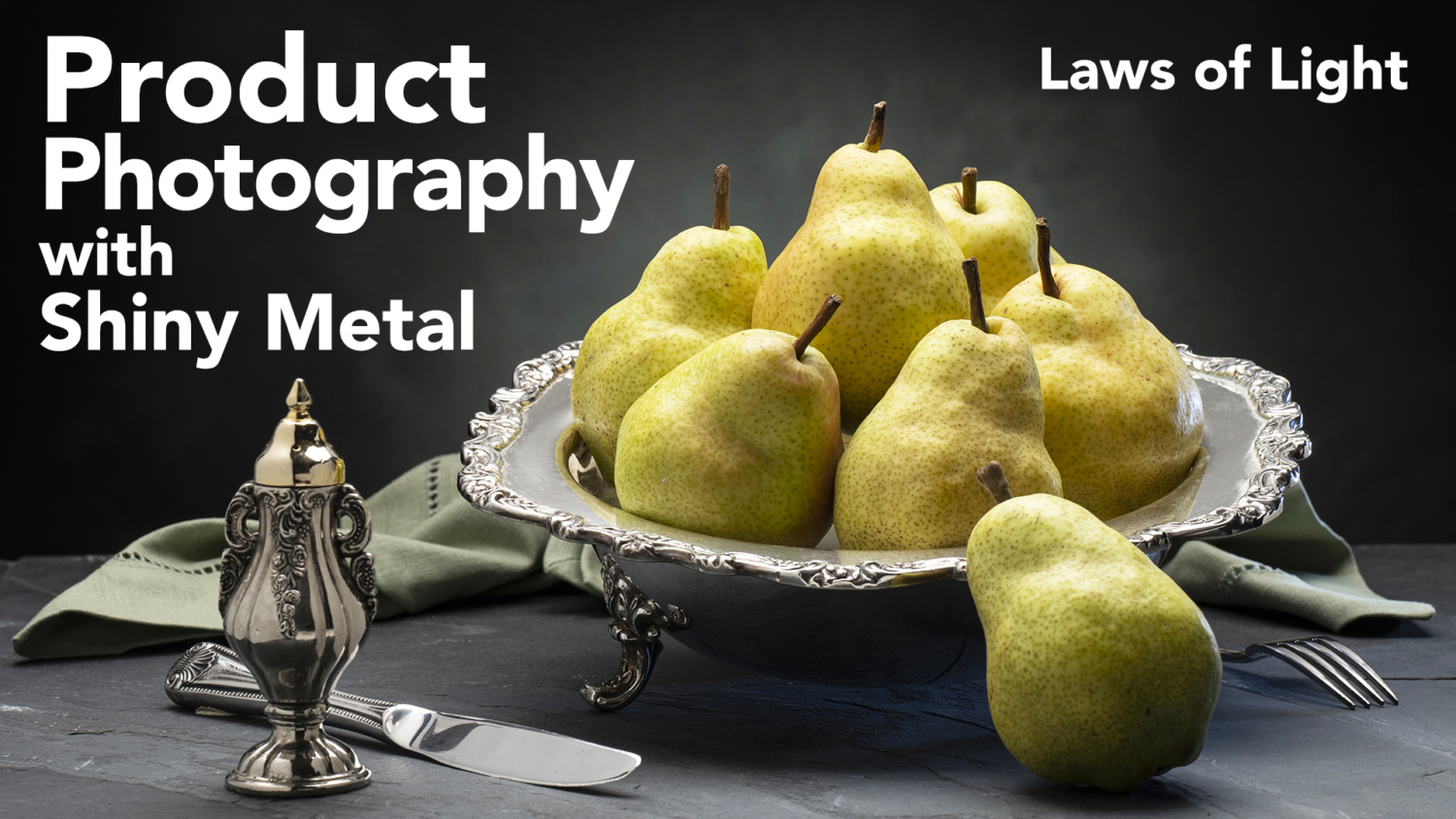
Let’s start taking the cards out one at a time and talk about what happened with each one of these cards till we get right back to the very beginning when we put up a single soft box with our bowl of pears underneath. And I must say Julene did the styling of the pears. I was working on it yesterday and the pears were looking pretty sad until Julene came along and fixed the pears. So they all look so wonderful and the composition looks so nice now. So let’s start. Let’s break this thing down. Let’s see how to light shiny metal in a still life and let’s get started see what we can do.


So let’s just talk about what we’ve got set up here. We’ve got slate we got at Home Depot. These are just a black slate that has a little bit of texture to it. To give us just some texture for the surface that it’s going to sit on. We’ve got a silver bowl that all the pears sit in.

In the background we have a modeled backdrop. That modeled backdrop is meant to be separated from our table up front because we want depth. 


There’s our overhead soft box. You see the beautiful light on the pears and things.


We’re now going to add a background light to be able to separate those pears.


We then add a little blue light on the camera right side to open up underneath the bowl.


We’re going to put a reflector to cut that light off so it doesn’t get too much on the surface next to the light and does its job underneath the bowl.


Then we’re going to put in that v-flat on the side. That’s going to open up the side of the salt and pepper shaker. It’s going to open up the shadows of the pears.


Then we add a reflector up front. It opens up the shadows of the pears a little more. And it gives us a little bit of light in the silver bowl up front.


Then we go for overhead eyebrow. We drop that eyebrow, clip it on the back of the soft box. That just brightens up that silver bowl completely too much.


So we’re going to add a kind of a double net in there. That double net is going to bring that silver down.


But it looks a little bit flat so we’re going to put in a cut piece of black and reflect just a little bit of light into that silver bowl so that it’s not all the same tone.


Then we’re going to put a card in to bring up our knife.


Then we’re going to put a cut piece of black to be able to give us a little bit of something in that knife so it doesn’t look like it’s all one tone.

Last of all I put a small piece of card on that salt shaker. That makes it so we’ll composite that into our final piece.


All right, so here’s our final setup. We have everything in place. Every card is in place and there’s a card in the shot. And there’s a reason this card is in the shot. And that is because that’s the only way I can get some highlight on the side of that salt shaker. 


Okay, the first thing I’m going to do is I’m going to pull out this little bit of black card. 


But now, the next thing I’ll pull out is I’ll pull out this card right here. This card right here was on an incident angle to that knife to the camera lens. 


From here we’re going to pull a couple of things out. I’ve got a nice little card up here. If you look at all this surface on top of the metal here, this little card right here just gradated it out just a little tiny bit. 


As I work backwards on that thought I put in this net. The reason I put the net in, is because the net took the amount of exposure, amount of intensity of the soft box, off from the card in the back. The card in the back is dropped down below our soft box so that it will give us gradation on top of the shiny metal.I want the soft box up and not too far behind so it’ll give us dimension in the pears. So I had to get the box up. Which meant I had to extend the area of the box. And this soft box is bouncing into that white and just giving me way too much on here. So I’m going to slide this out. That’s going to make a huge difference.

So what that flag did was, it brought down the exposure on the silver bowl and also gradated the background a little bit. We see a little bit of, it’s a little darker towards the back of the set. And it really gives us a nicer gradation into the scene. But it also helped the gradation on that bowl. We have a much nicer gradation. Like right now, it’s just so silver.


But let’s go to the next step. Let’s see what we do next here. All right, next I’m going to remove this little eyebrow, this little card that I clamped to the bottom of my soft box and get a shot there. That’s going to really make that entire bowl go much darker. 


But now we should go back. I’m going to pull another card here. I’m going to pull this card up front. This card up front was just simply meant to open up some things in the foreground. I’ll pull this card out. It’s not a very, this one doesn’t do a lot. 


So now we have our salt shaker on the side. We really, this card right here became a fill card for the pears and became definition to the salt shaker. 


So now I’m going to take this little card out. This card is meant to cut the strobe off from the napkin and off from the ground here. So as I take this card out this strobe is going to get pretty bright in that corner. 


So that light really gave me a little bit of glow underneath. I added that light before we put the napkin in. And so it’s not giving me as much as it was. I could have maybe dressed that light a little more forward. 


Okay, for the next light I’m going to turn off, I’m going to turn off the one on the background. This background gives us the most amount of separation because it just gives a little spot. 


So there’s the background light turned off. And you can see now we’ve got a very dark up front. It’s just the pears. We’re not getting any depth at all. So that made a big difference.


It’s all about what you reflect into the shiny metal. Whether it’s white or black. Whether you create a dimension by gradating, you just want gradated. You don’t want it to be all the same color or it looks plastic. You want some black in it so it just gives you some gradation and it feels like metal. Because metal reflects and you want to give a sense that it is reflecting.

All right, let’s wrap this up. There are several things here that make this successful. And that is that you’re looking into the incident angle and you’re reflecting either white or black to create some kind of dimension. 


So Julene did such an incredible job of styling this. She wrapped that cloth around. That gives us a nice framing and breaks up the back line across the back of the image. And then really the way she did the pears was fabulous.


So if you like what you learned here leave a comment. Post some of your images in our Facebook group. Let’s see some of the product work you’re doing. I love this kind of meticulous product. It can be a lot of fun. I didn’t use to have the patience for it. But I feel like I’m enjoying it more and more as I do more of it. Just a great way to express yourself. So get out there. Do some product stuff. You make sure you subscribe to our channel. Support us any way you can. We appreciate it. So keep those cameras rollin’ keep on clickin’.

One of the greatest things about music is when go out there and you see people for that hour, that 90 minutes, whatever it is. Forgetting about everything. 
